Click the image below to view the clickable prototype
Video Walk-through
TAKEAWAYS
1. To reduce visual complexity, I considered how to group similar types of information visually in a way that is logical and intuitive to users.
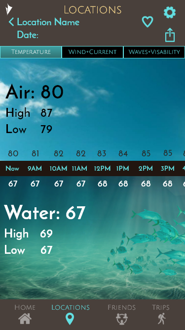
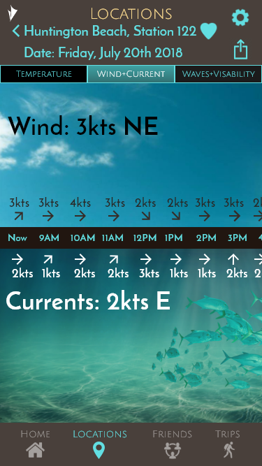
2. Visual cues followed those that users would see in their natural setting, with all weather data above and below water arranged on the screen as the user would expect.
3. Flexibility early on in the structure of information architecture allowed for easier design changes in following iterations.
OVERVIEW
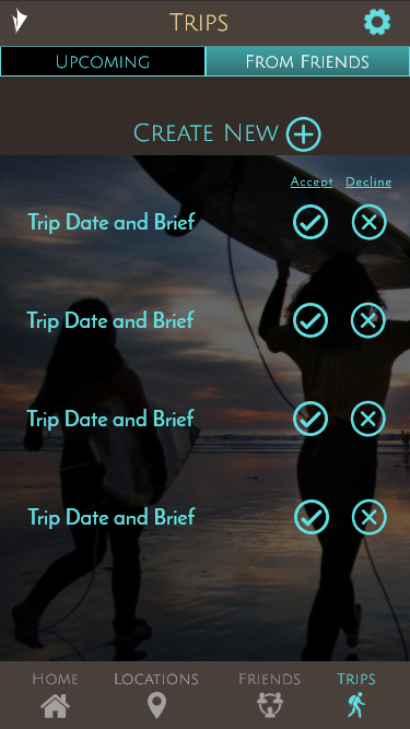
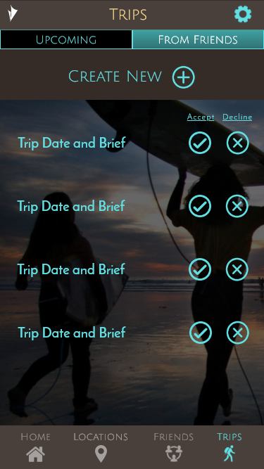
VELA water sports app: Providing information for various water sports enthusiasts to get more out of their experiences on or in the water.
The challenge: Create a new app that presents communications and weather information in a way that is easy to understand to a wider base of users.
RESEARCH GOALS
What information about weather patterns is the most useful to the widest user base?
What is the best way to present large amounts of information in a way that is visually simple to view?
Determine what will help increase adoption.
USER RESEARCH AND ANALYSIS
With a script and a list of questions developed to help uncover important information presented by my research goals, I began to interview potential users. The answers given were then used to create an affinity map where feedback could be analyzed for insights into the users current behaviors and pain points.
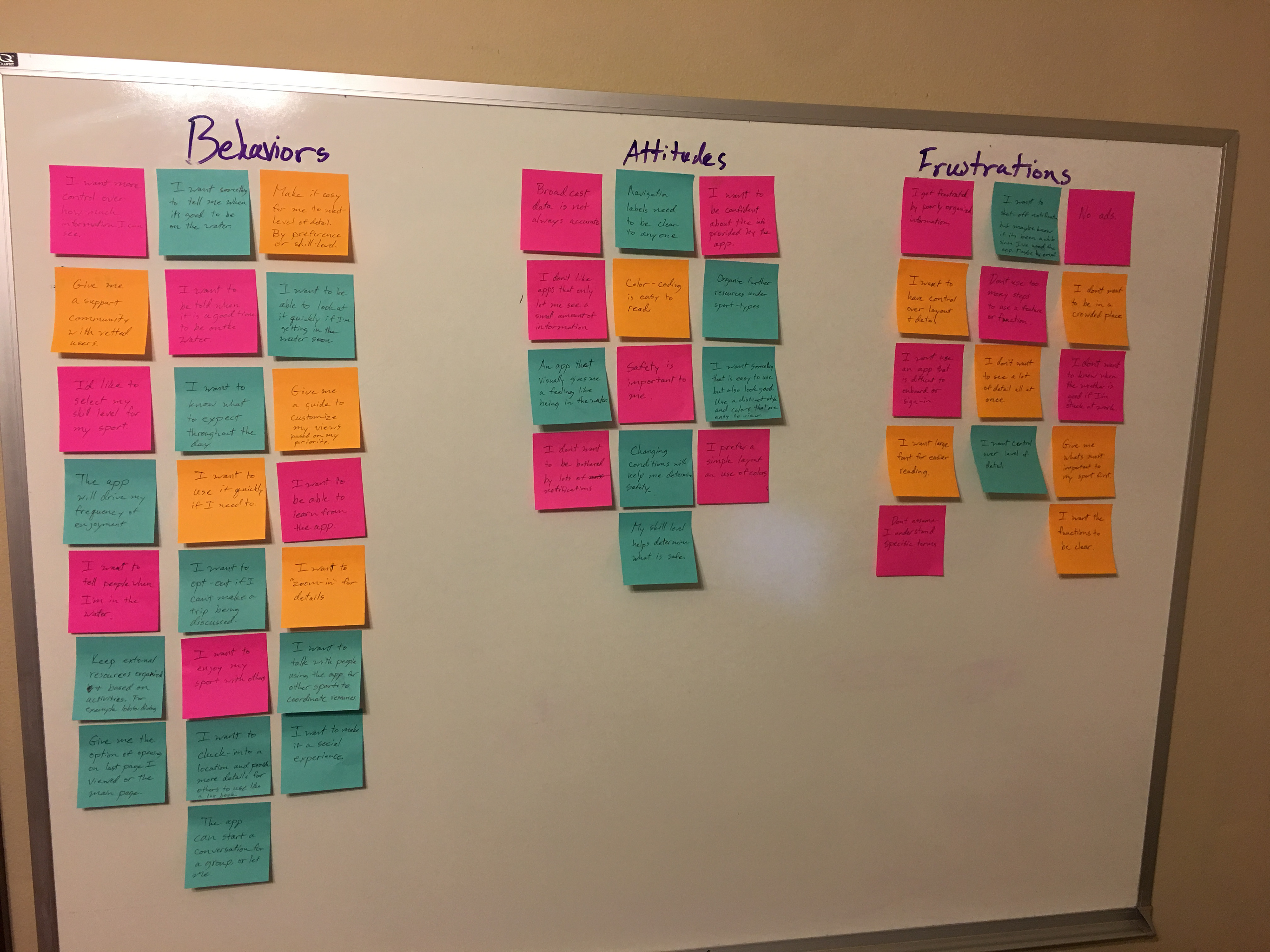
The insights provided by the affinity map were used to develop an understanding of what would be truly useful to users and gain adoption by a wider group of people.
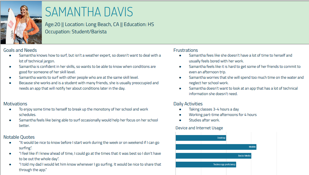
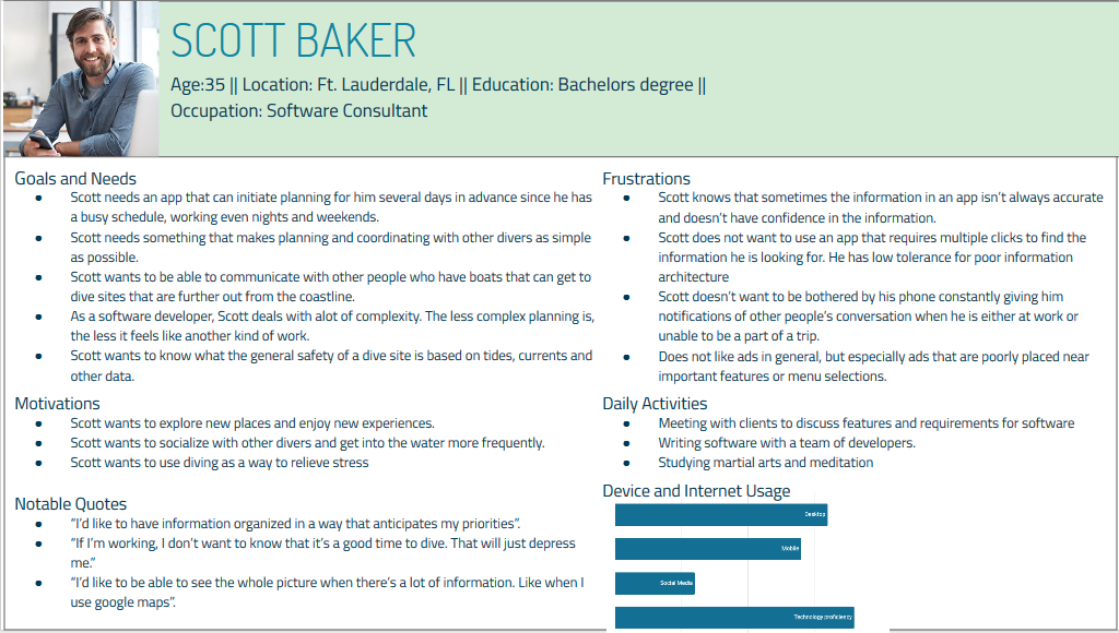
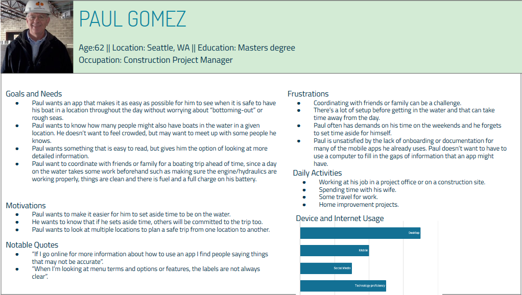
USER PERSONAS
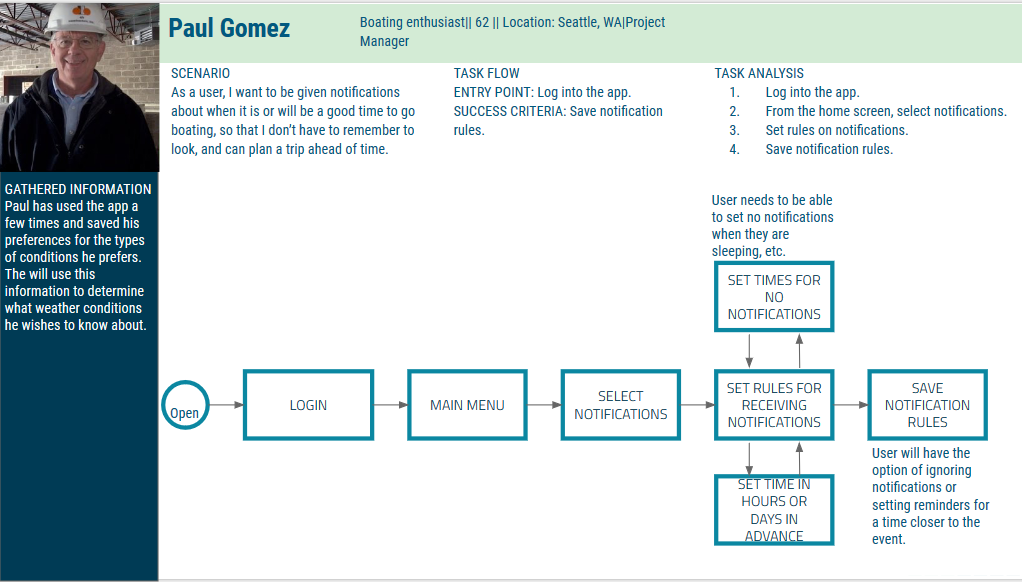
To aid in the development of design ideas for a team of designers and developers, user personas were created from the research data. The personas put a human face on our potential users and help a team empathize with users and keep their needs at the forefront when considering design decisions.
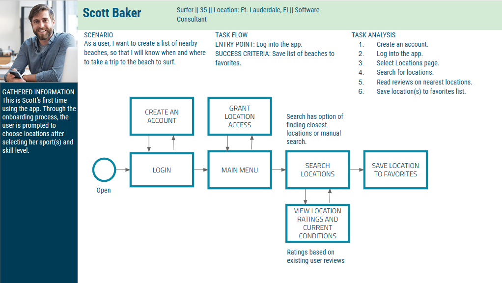
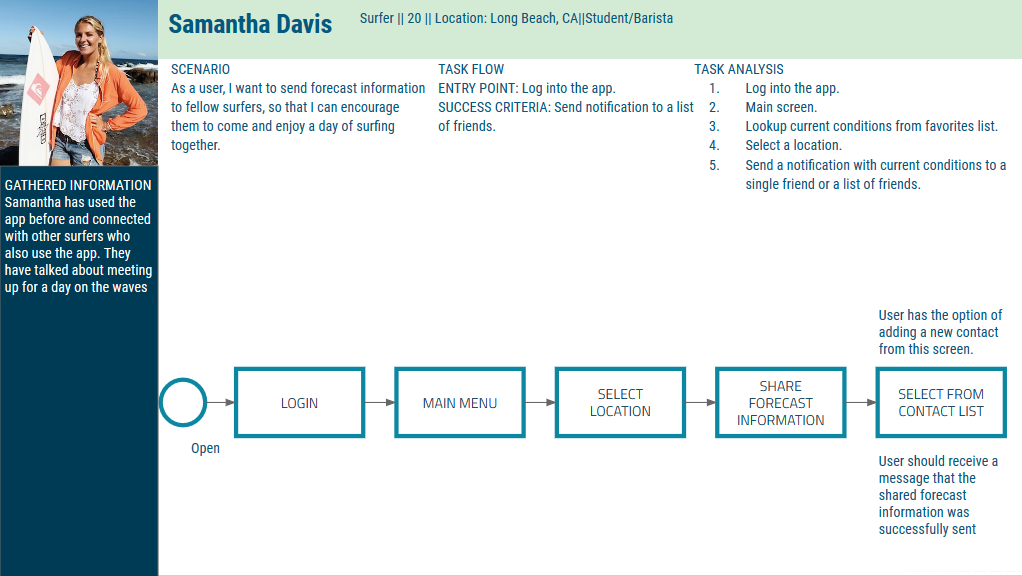
TASK ANALYSIS AND USER FLOWS
With the user personas and insights, a set of diagrams was created to show each step the user would take to complete a task that was needed by the user. These diagrams would later be used to determine how to arrange the overall information architecture.
Low-Fidelity Wire Frames
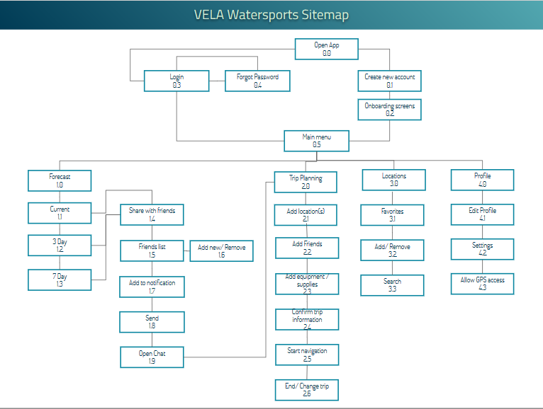
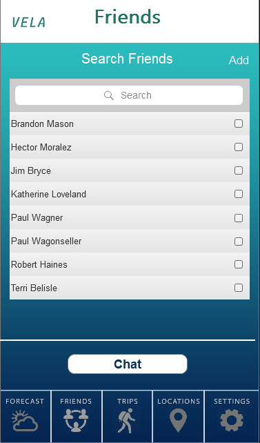
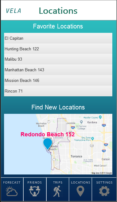
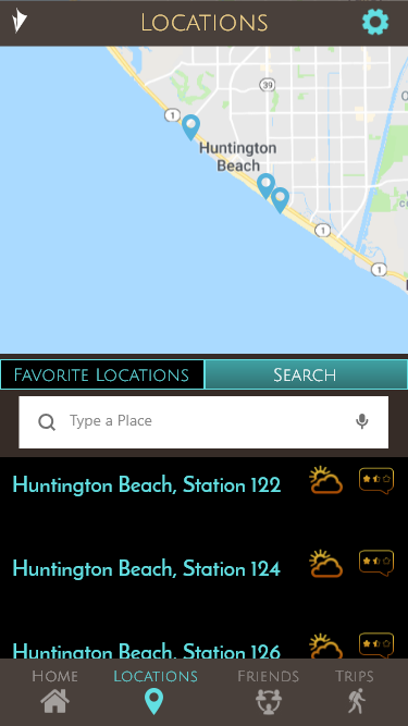
SITEMAP AND CLICKABLE PROTOTYPE
User flows describe how the users would interact with the app and create a picture of what functions the app needed to perform. A sitemap was created to organize pages and information architecture. From this, a series of clickable prototypes
was developed to demonstrate the functions of the app. These prototypes would next be used in testing to see how they met the expectations of users.
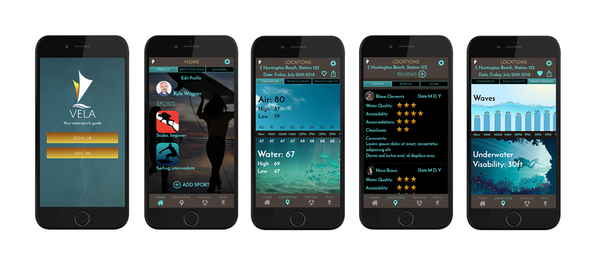
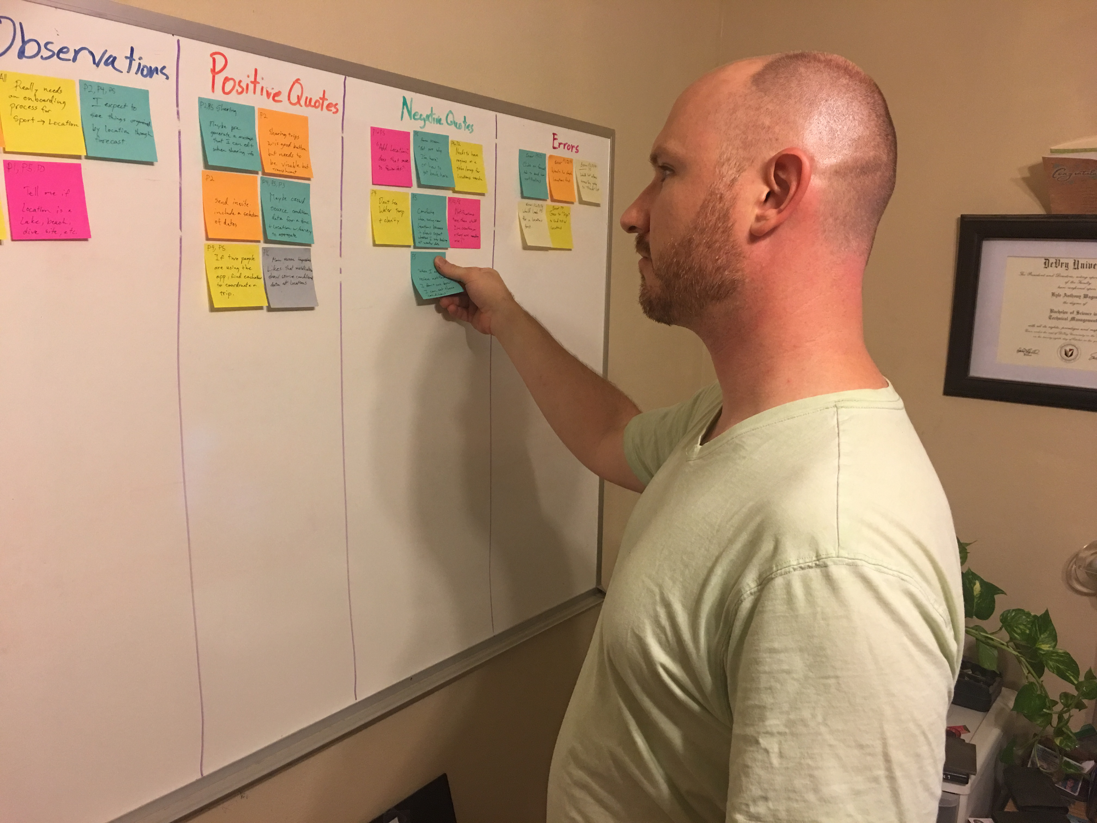
TEST RESULTS AND REVISED DESIGN
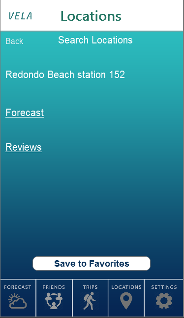
With feedback and analysis from user testing, the information architecture (IA) was reorganized to match the behaviors observed from the users. Visual design was refined to create a consistent design language for VELA.
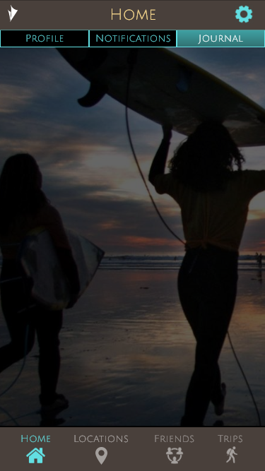
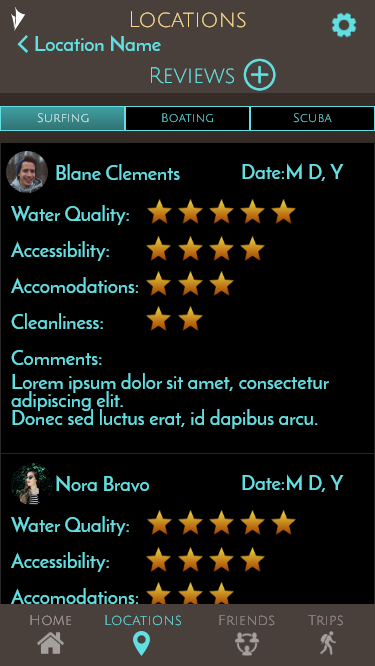
DESIGN LANGUAGE AND PATTERN LIBRARY
The pattern library and design language developed for VELA were derived from a palette of colors familiar to water sports enthusiasts while taking into consideration the practical needs of high contrast for outdoor use in full sun with glare.
